Trader joe's.
- Packaging.
The brief.
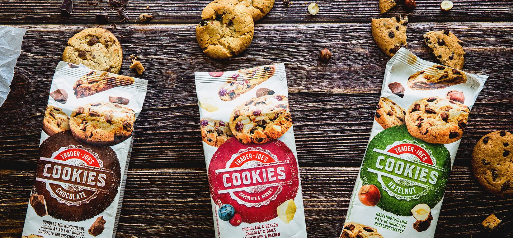
When Aldi wanted a refresh for their Trader Joe’s brand of delicious cookies, they didn’t hesitate to call on in fine to whet their customers’ appetites for more. The aim? To give a more 'traditional' look and feel to the entire range: from the chocolate & berries to the hazelnut paste and the double-choc chip... for great-tasting results, inside and out!Our approach.
The colour white evokes a more traditional and wholesome product, while forming a neutral backdrop to highlight the cookies’ star ingredients. The new branding certainly hit the spot, inciting desire for a moment of pure chocolate indulgence. And the final ‘in fine' touch: a photo shoot giving each flavour its own warm, natural and inviting universe.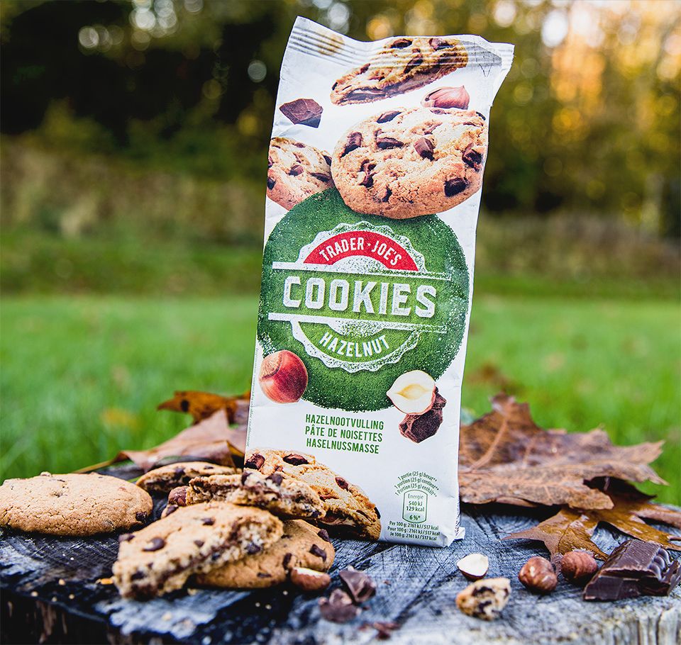
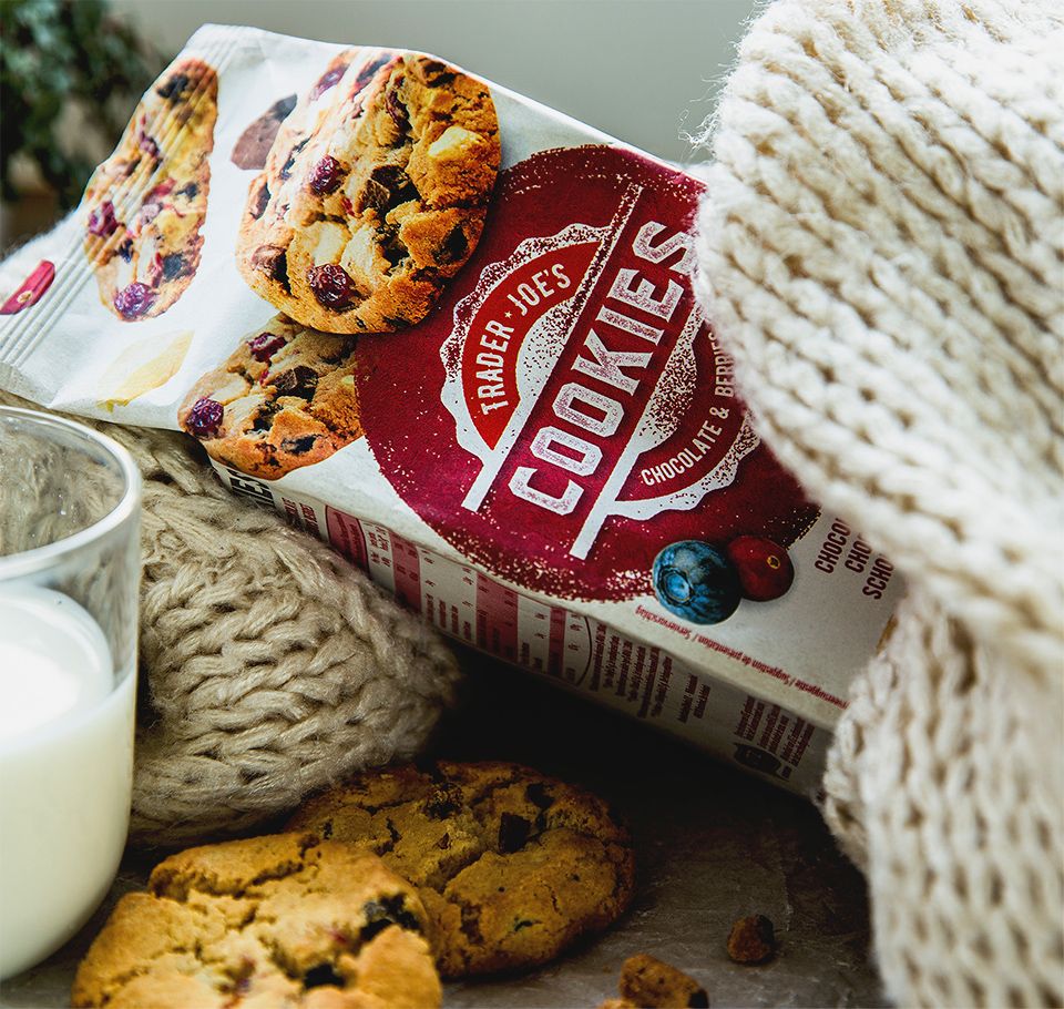
A mouthwatering rebranding for lovers of Aldi’s cookie brand. Using quality paper as packaging support. The result speaks for itself. And tastes even better! :-)
Why work with In Fine?