Horus Software.
- branding
- web
The brief.
How do you make a promise visible when you can’t really show it?
Horus is accounting software designed to save time for accounting firms and businesses. It’s a key benefit of the product, but a difficult one to translate visually: how do you represent time saved?
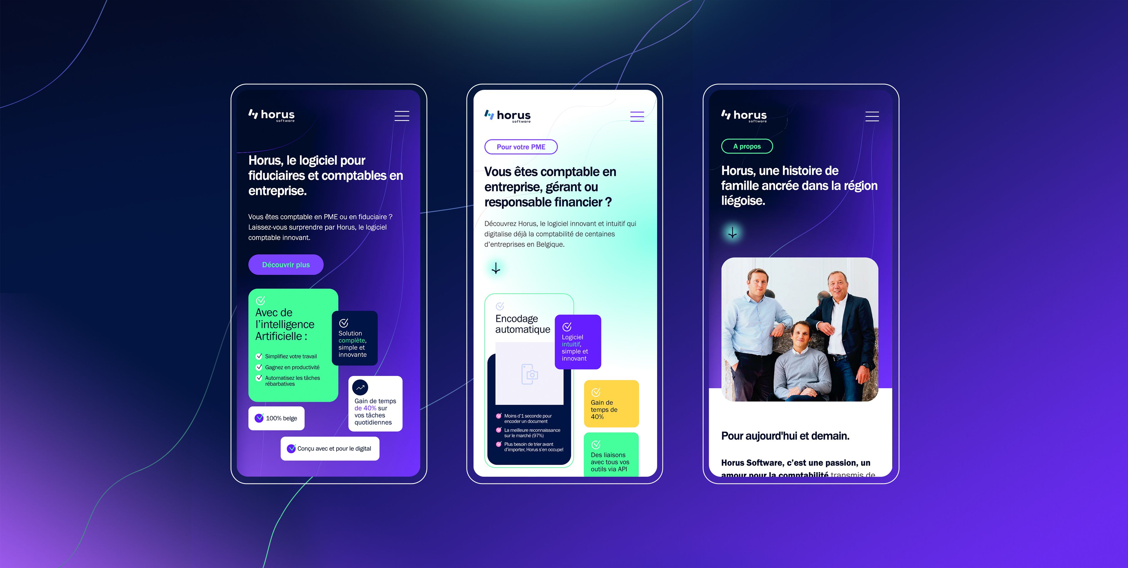
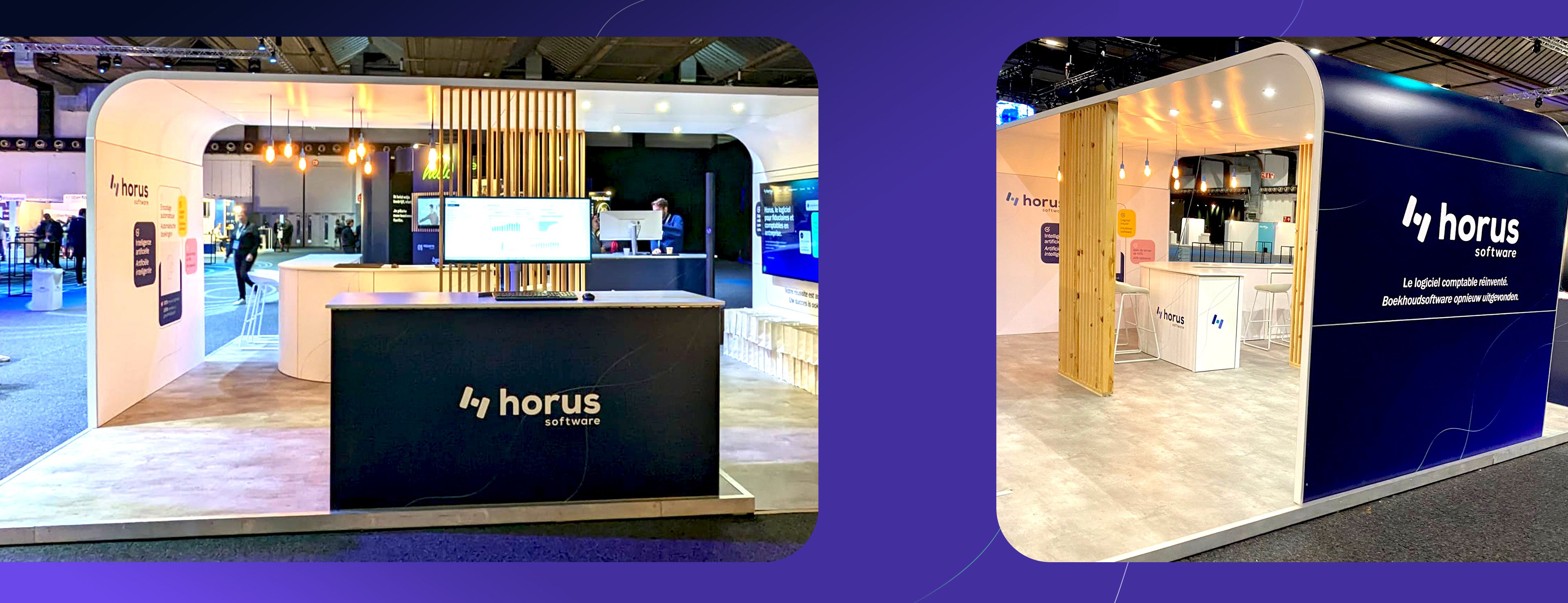
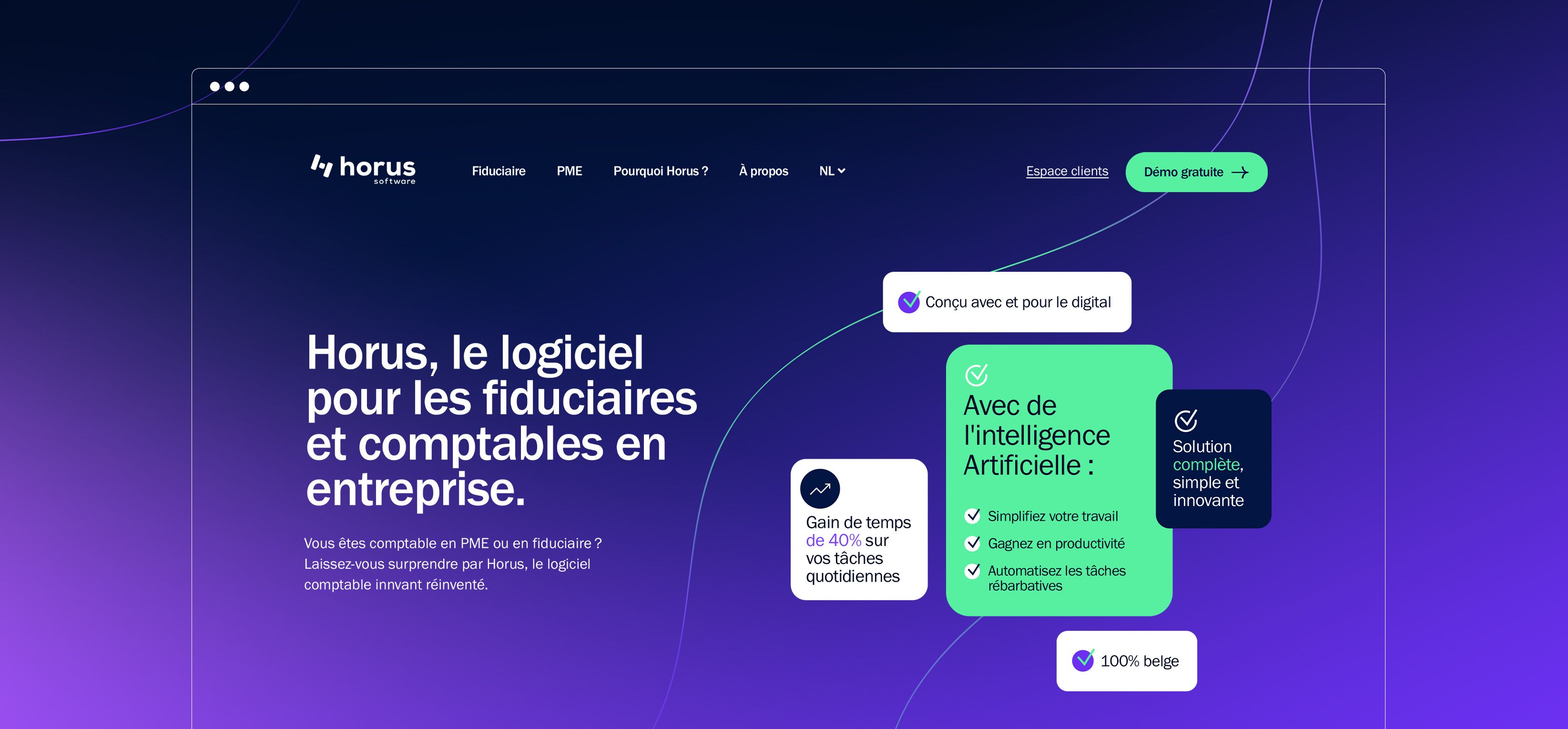
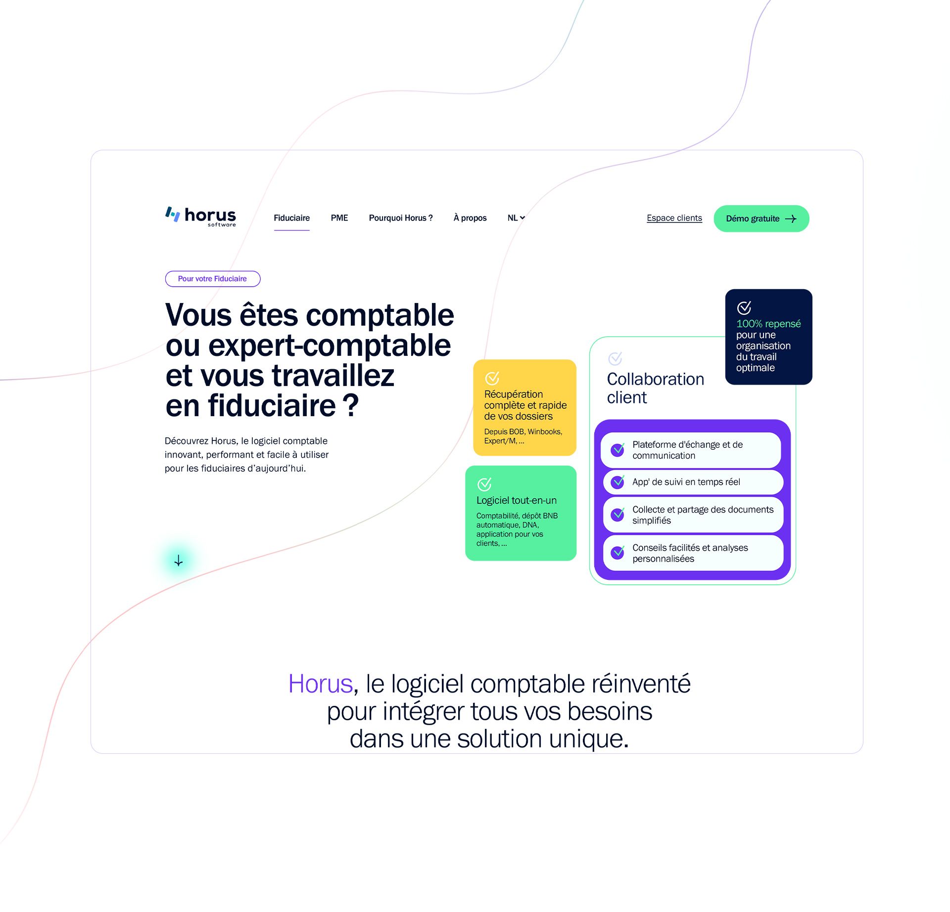
The logo already existed. Our mission was to build the entire brand universe around it, with an identity flexible enough to work across the website, the application and physical materials, while giving the Horus team the freedom to evolve it themselves.
Our approach.
Giving shape to time saved.
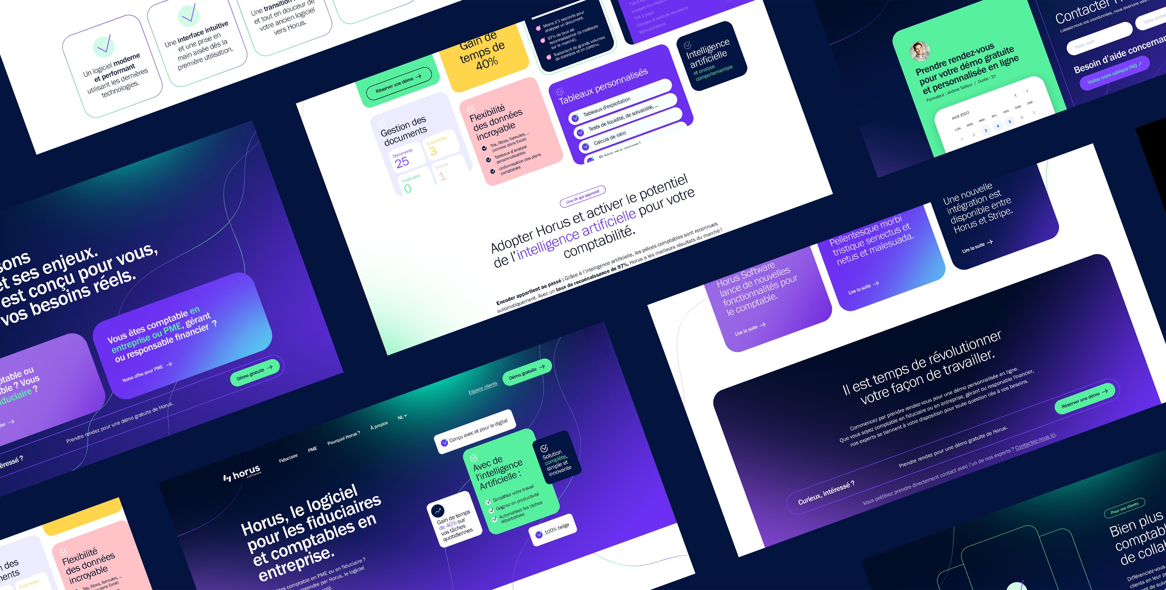
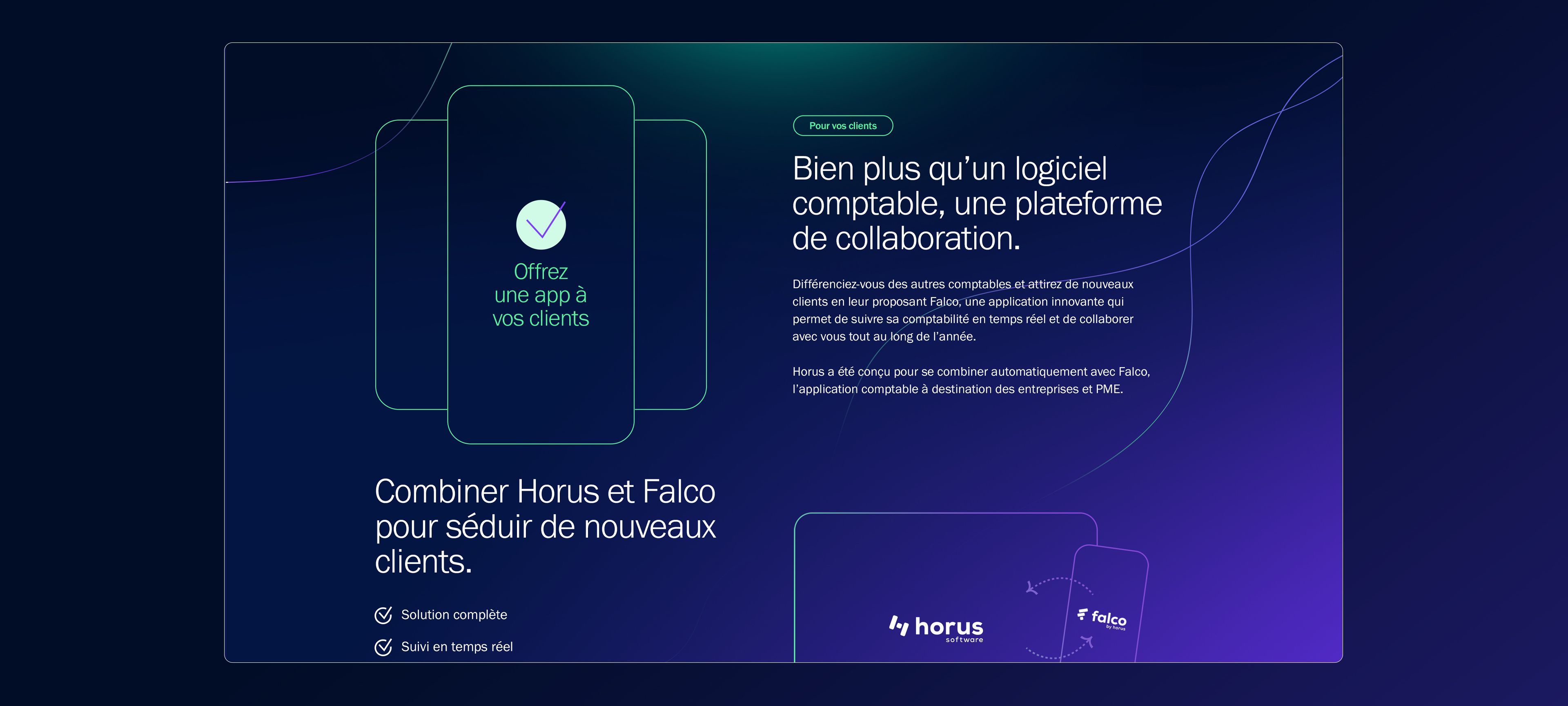
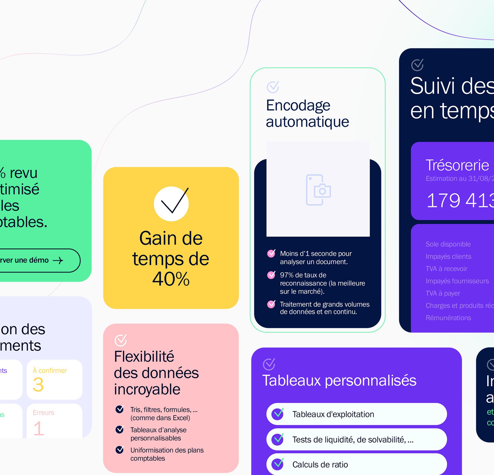
We built the identity around a system of lines that cross, connect and move forward. They symbolise the link between the accountant and the business, but also suggest fluidity and continuity: less friction, more time for what really matters.
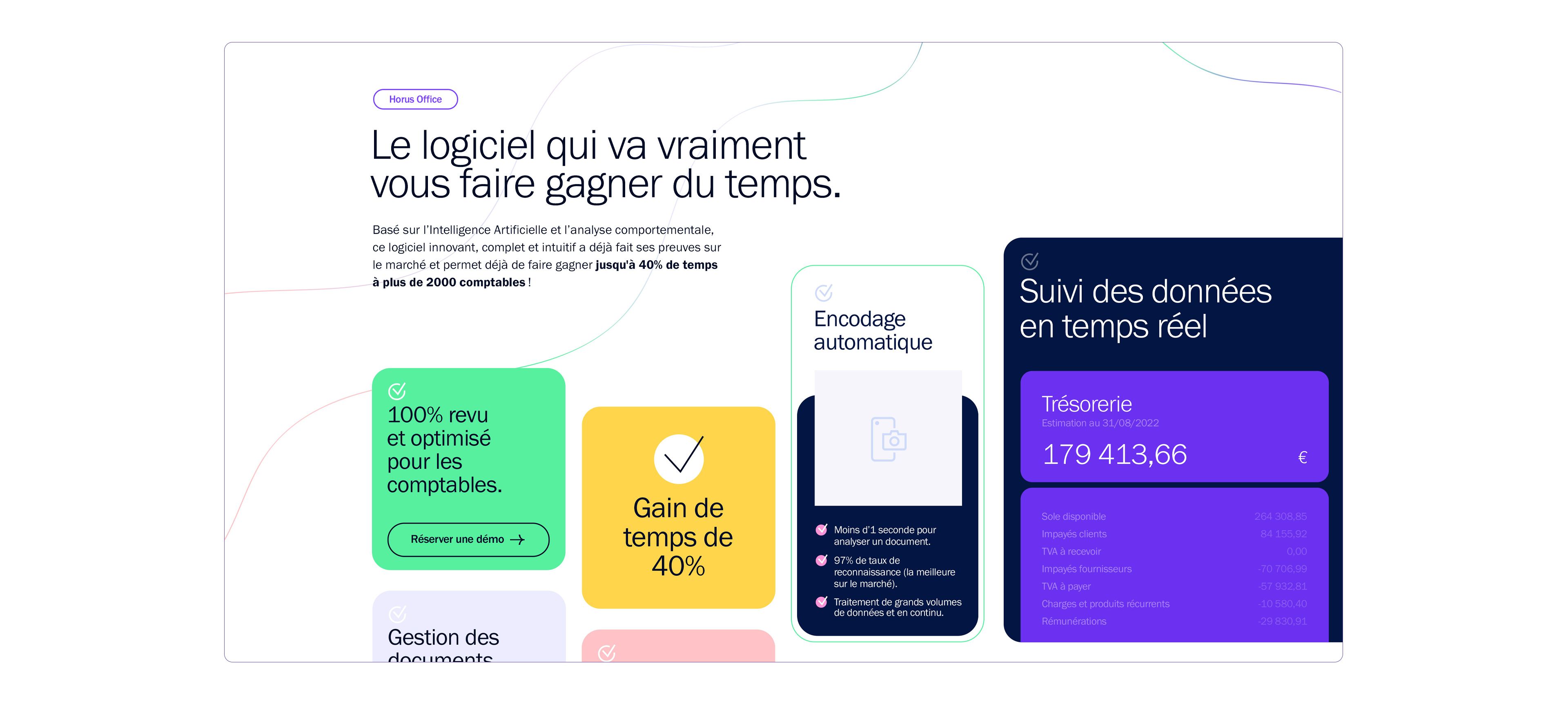
This idea runs through the entire identity. Warm colours and a dynamic visual direction bring a more human feel to the world of accounting, while direct messages such as “The software that really saves you time” and “We know your business” make the product’s benefits immediately tangible.
The identity was then designed as a modular system, able to adapt across different templates, from the website and application to physical materials. And because saving time also means being able to move forward independently, we designed a builder that allows the Horus team to manage and evolve their communication themselves.