Belgian Owl.
- packaging
- b2c
The brief.
It is with great pride that In Fine partners with Belgian Owl to celebrate the 20th anniversary of the iconic Belgian whisky from the Hesbaye region.
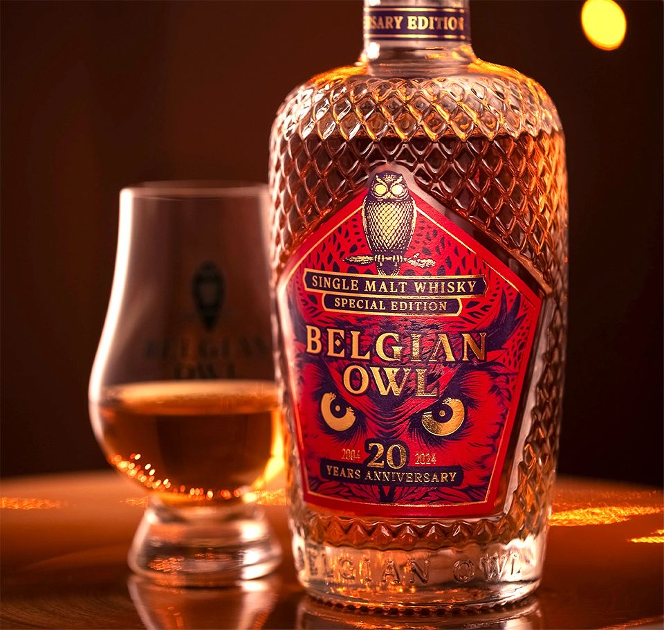
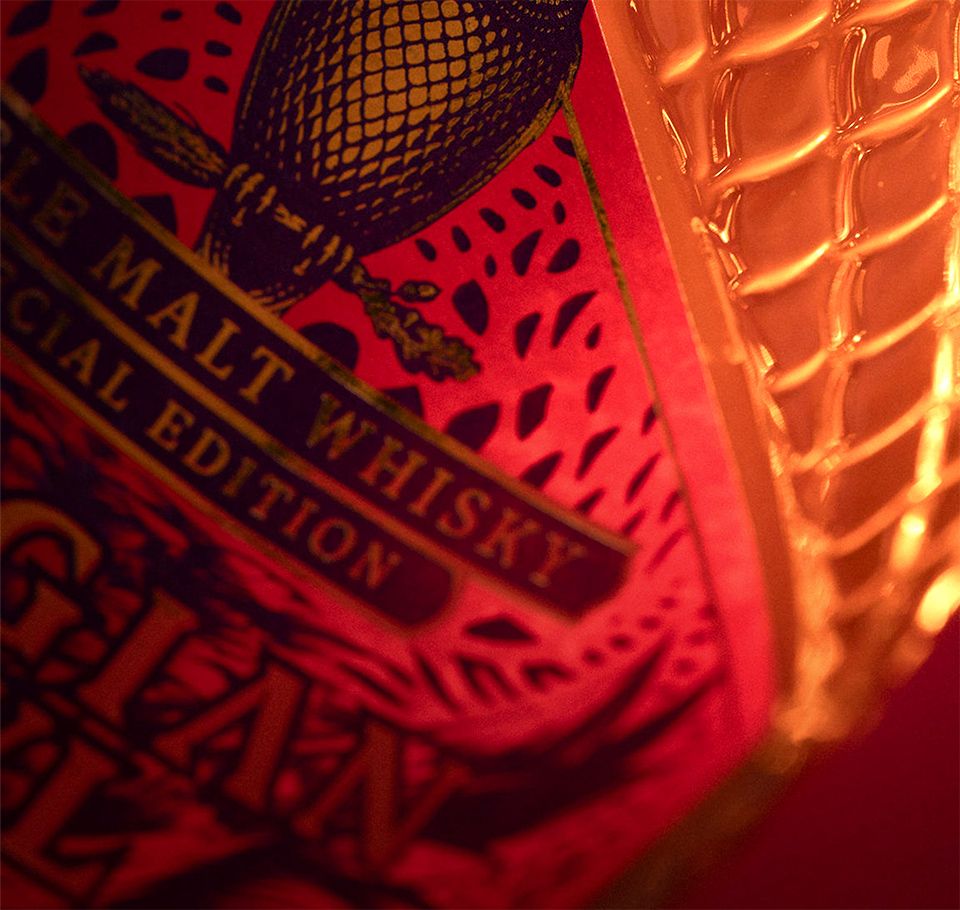
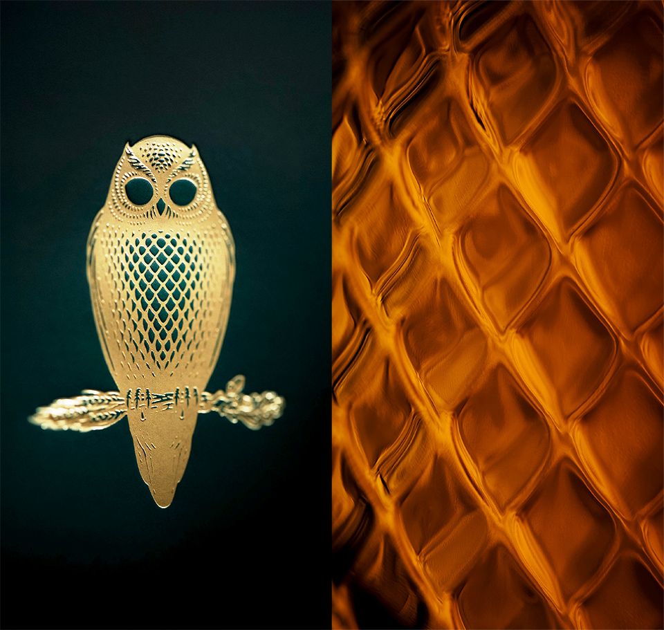
To mark the occasion, a limited edition has been released: a rare and authentic whisky, distinguished by a subtle red fruit signature. Each drop reveals the exceptional craftsmanship of Belgian Owl, embodied by the golden owl — a symbol of precision, balance, and passion.
A whisky deeply rooted in its Belgian terroir, crafted for discerning connoisseurs… and for those who dare to venture off the beaten path.
(Credit: Idrisse Hidara)
Our approach.
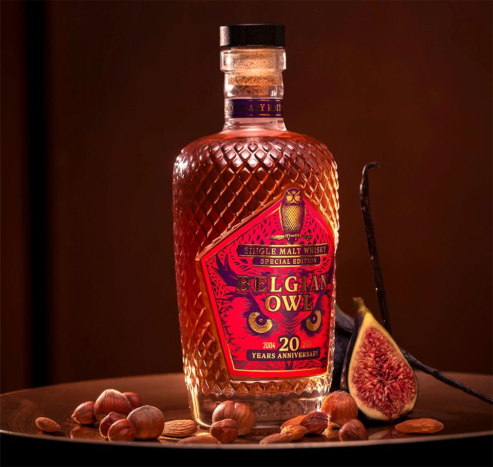
Our intention? To highlight the aromatic richness of this limited edition.
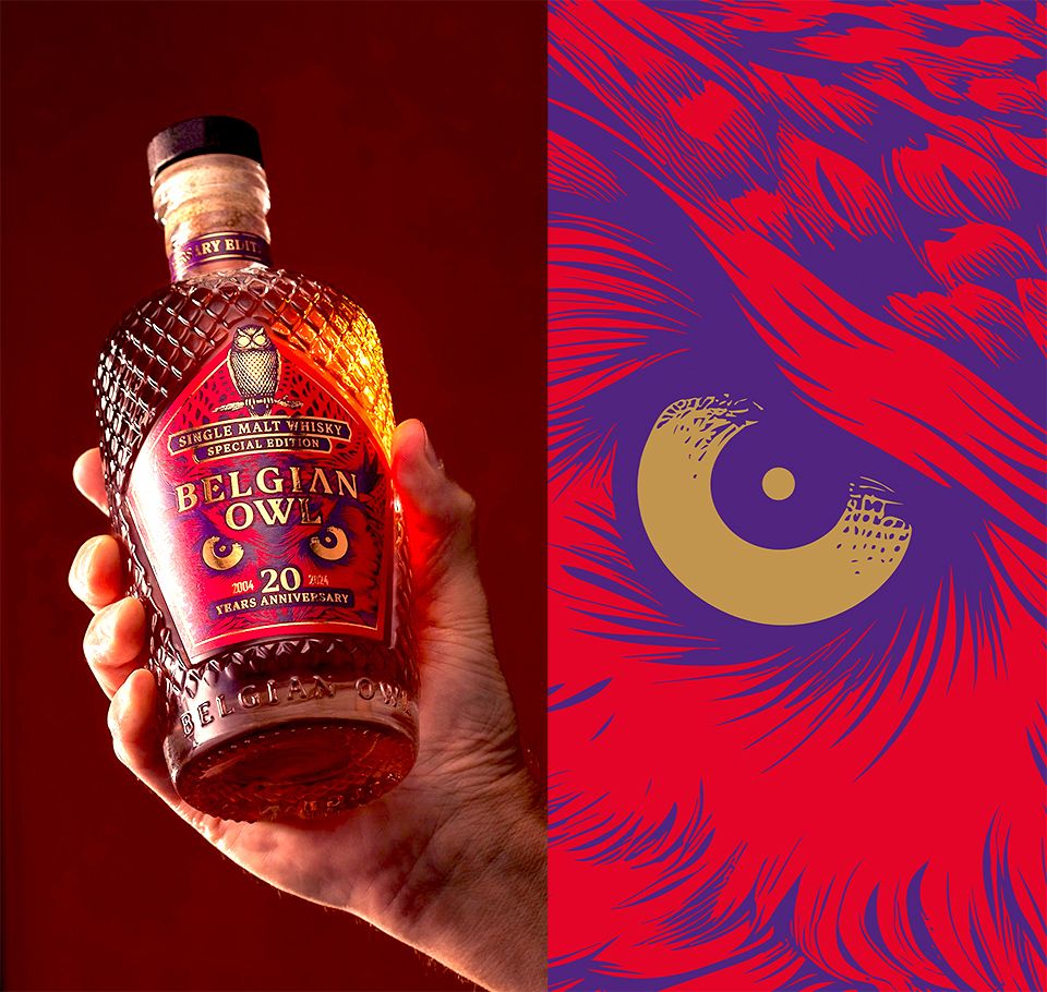
To echo the delicate red fruit notes that linger on the finish, unveil the gourmet intensity of hazelnut and almond, and elevate the caramelized signature - somewhere between crème brûlée and honey - that defines the House’s reputation. The deep red running through the design also nods to the subtle presence of spice. A bold, refined and surprising whisky that deserved a packaging worthy of its character.
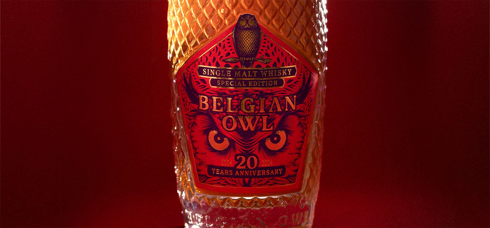
A gaze that says it all
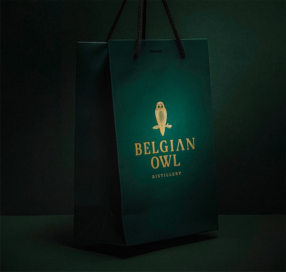
The golden owl, Belgian Owl’s emblem, stares straight at you. A look that seems to say: “Beware - this is no ordinary whisky.” It reflects the strength of the brand, its authenticity, and tells the story of a Belgian distillery that became iconic in just 20 years.
Teamwork and a standout campaign
From the first creative ideas to the final shoot (credit: Idrisse Hidara), every step was designed to elevate the product. A project driven with pride by the whole team, right up to the digital launch. And what a launch it was: the bottles flew off the shelves in no time — a clear sign of the immediate success of this exclusive edition.