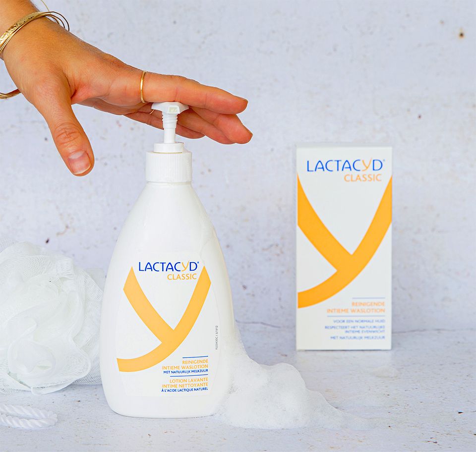
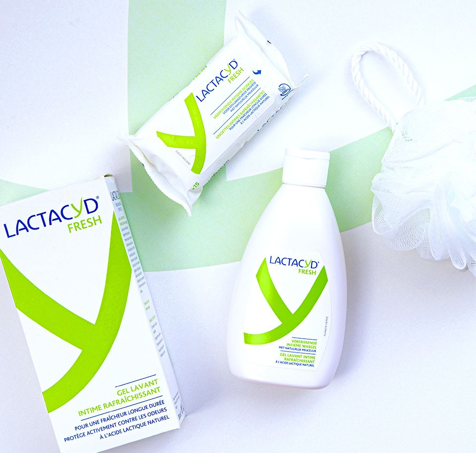
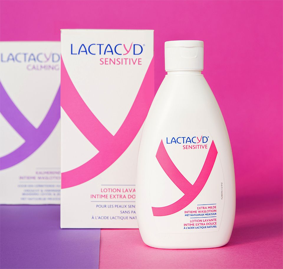
Lactacyd.
- packaging
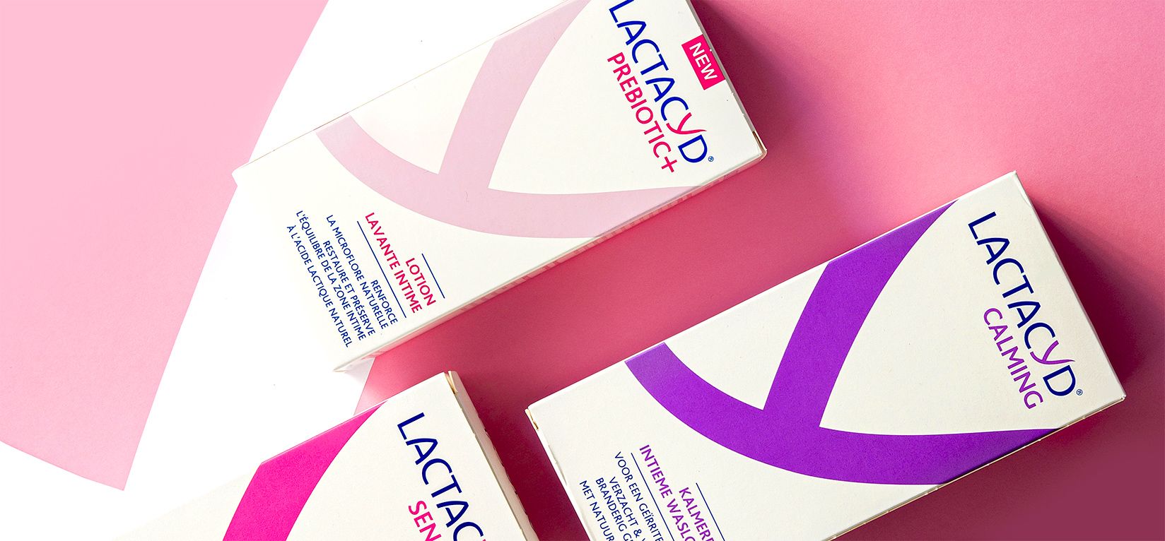
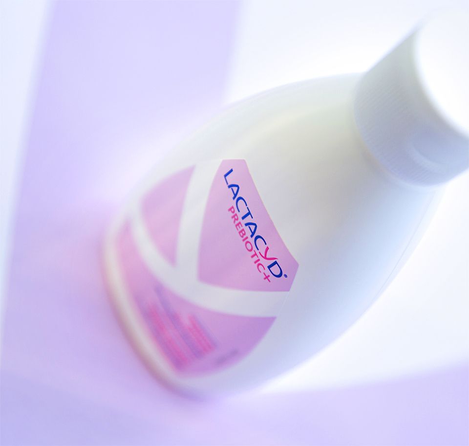
The brief.
Feminine intimate hygiene specialist Lactacyd was looking to freshen up its extensive product range and give off a more youthful vibe, while maintaining its reputation for reliability and extensive expertise.
Our approach.
Back to basics! We revived the brand’s traditional symbol – the Y, which subtly hints at femininity. We transformed it into the main feature on the pack, making it impactful and highly memorable. We also reworked the architecture to make it clearer. The bright, modern colours on the new packs really make them pop... They’re sure to catch Generation Y’s eye!
Speaking to a generation who are constantly on the move and who think very differently was a challenge we relished!
Why work with In Fine?